
During my time as Design Lead for Grocery & Retail Stores, one of the largest bets me and my Product Manager Cailyn Criniti envisioned for the future of the pod was Grocery Shopping Lists for Uber Eats.
Not only it was brought time and time again as one of the most missed features from Cornershop —a grocery delivery app in LatAm acquired by Uber and absorbed into Uber Eats— during LatAm user-research sessions, it was also a unique opportunity for us to leverage our canonical product catalog and our large selection of grocery stores to play a key role in boosting grocery retention, basket sizes, and driving habitual use.
This project was later taken by my colleague Alex Huang on Design, after I switched gears to leading Consumer Offers on Eats, and Sharon Wong on Product.
These concepts stem from my time leading this workstream on Design, along with both Cailyn and Sharon on Product.
Defining a Shopping List
Introducing a new construct to billions of users worldwide is generally a major bet and, as a grocery delivery platform, figuring out where Shopping Lists fit in within our existing ones —eg. how is it different from a Cart— and generally defining what is a Shopping List is a question that has multiple answers.
Semantic alternatives
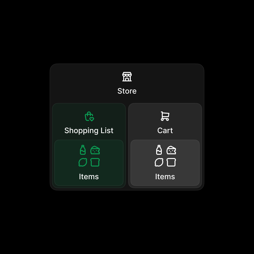
A simple way to think of a Shopping List could be to give it a similar treatment as a Cart—a child of a Store, with its own unique set of items. But there were many limiting factors, from taking into account the traffic ratio of people who enter a Store in the first place to just how much more headroom we had to build something more magical.
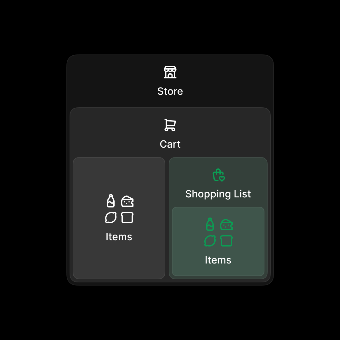
Another simple approach would've been to treat Shopping Lists as a "Save for Later" feature, and bundle it with the Cart construct. While this could be a useful feature, it wouldn't have necessarily moved the needle on our main goals —boosting grocery retention, basket sizes, and driving habitual use— if people weren't making grocery carts in the first place.
Our approach — Store-agnostic, item-forward Shopping Lists
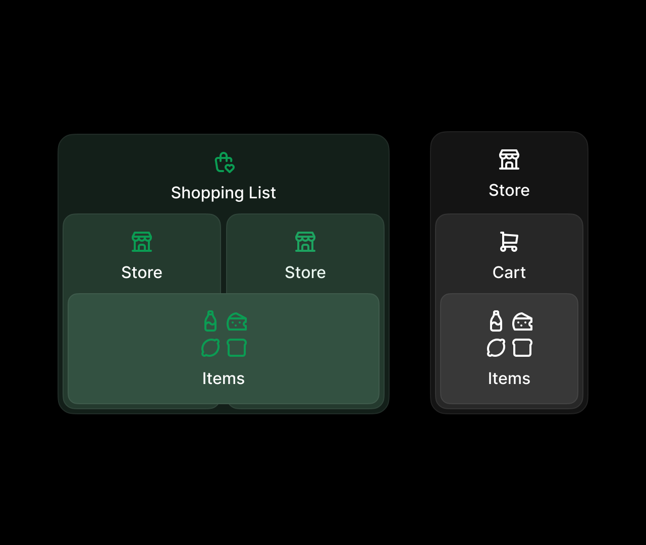
After jamming on this internally and extending the brainstorming sessions to a wider range of designers through a Design Sprint, we landed on our final architecture. Store-agnostic, item-forward Shopping Lists.
By making Shopping Lists store-agnostic, we have the flexibility to introduce them to lower intent, upper-funnel surfaces, while still allowing them to filter items on a store-level basis. This flexibility ultimately allows us to introduce things like comparison shopping, or even enabling Lists to flex into a "Saved for later" feature when needed.
Ultimately, of course, the goal is for more Shopping Lists on the platform leading to more Carts.
Creating a Shopping List
One of the concepts we explored to help users jumpstart a Shopping List were these playlist-like "collections" of items to show users when they start a Shopping List from scratch.
Collections could be dynamic, and respond to hints like the list name, past orders, existing items on the list, etc.
Looking forward, we also explored ways to incorporate Lists into existing flows, like searching within a store.
Comparing prices
One of the key differentiators and growth drivers we looked to incorporate into the feature was comparison shopping.
Internally, one of the aspects of comparison shopping we particularly debated was whether or not users would like to compare and buy all of their items at once, and where should we make assumptions about it.
Our Product leaders were generally very bullish on the idea that most times, most people would like to price-compare a subset of items of their Shopping Lists instead of all at once, so I explored a few alternatives of how a branched price-comparison flow could work.
Swipe to save
Given our unique advantages as a platform, we also aimed to make the feature fun and delightful. One exploration we made under this umbrella was allowing users to get into a "Make it cheaper" mode, where they'd be able to swipe their list to swap items for more and more affordabe alternatives.
From List to Checkout
One of the main challenges of introducing store-agnostic Shopping Lists on a platform with such a large store selection and a diverse canonical catalog as Uber Eats is choosing where to checkout from, when and if to choose a default store, etc.
These concepts explored a few different alternatives to go from list to checkout, and served as anchoring visual guides to drive cross-functional conversations between Product and Design when talking through the problem space.
Choosing a store at the end
Choosing a store at the end has some tradeoffs to keep in mind. It's cleaner visually, as it tucks complexity away until the end, but in doing so it's also less transparent about where a user might find all of the items in their Shopping List, potentially getting in the way of faster decisionmaking.
Draft Cart
We also played around with the idea of a "draft" Cart—meaning, a preview of what your Cart would look like in different store combinations. This concept kept the simplicity of the first one, while still providing more control at the end.
Parent store
While our aim is for Shopping Lists to be item-forward, introducing the concept of a "parent store" in the context of viewing and managing one resonated to us for three main reasons:
- For users, it enabled faster decision-making by immediately mirroring what they'd see at checkout.
- For us, it matched a key requirement of the ultimate job-to-be-done —checking out—, as well as how we treat all grocery collections in the app.
- For stores, it meant they could remain front and center to the experience, and don't risk having their products mixed up with the competition.
This concept managed to still tuck some of the complexity away, while enabling all three side-benefits.
Our approach — Exposed store selector
Lastly, we explored giving full control to the user upfront, allowing them to quickly switch back and forth between parent stores, and compare.
This option had by far the most positive response when performing UXR with actual users, and is the one we ultimately went with.
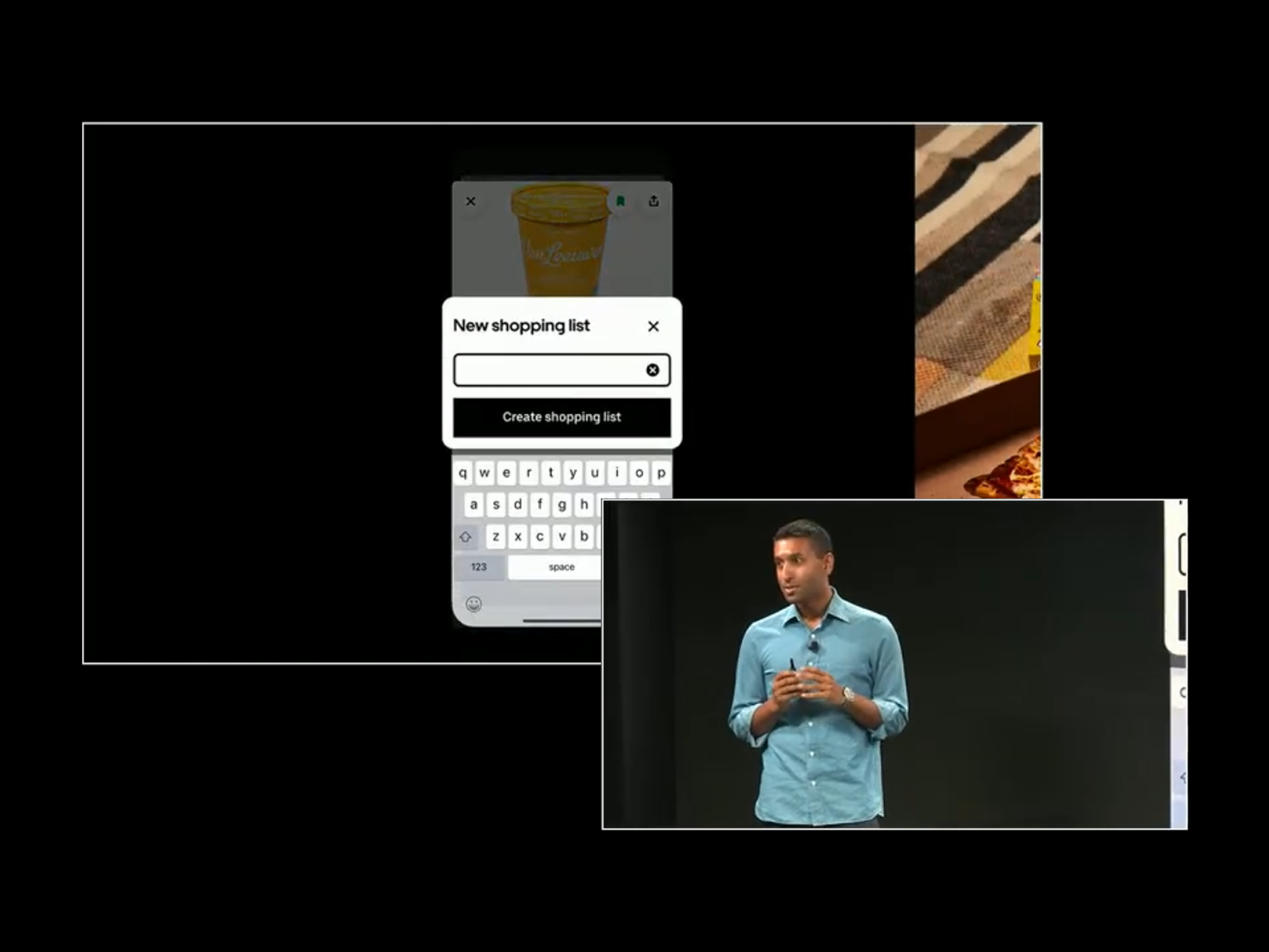
This project was recently introduced at Uber's annual product event, Go-Get 2025, and will be available to users later this year.
When
2024 — 2025
For
Uber
Discipline
Product Design
Product
Cailyn Criniti
Sharon Wong
Farid Hosseini
Shiva Rajaraman
Design
Laura Sandoval
Alex Huang
Katy Tsai
Research
Vanya Mittal
Jing Jing Tan
Engineering
Ilya Uts